rafaelrodrigues

Creating a Patient Monitoring System

Designing a scalable monitoring system for hypertensive patients without increasing nurse workload.

0 TO 1 DESIGNWEB & APPHEALTH

Context

Medicinia

Health-tech startup focused on safe, human-centered communication between healthcare companies, physicians and patients.

MOPE

Special Patient Monitoring Team (MOPE in Portuguese). Nursing team dedicated to remotely monitoring patients from the health insurance company São Cristóvão Saúde (based in Brazil).

Problem

Business Problem

The MOPE nursing team remotely monitored hypertensive patients through a fully manual process. With patient volume set to grow, nurses were still relying on WhatsApp and spreadsheets to coordinate care and track readings, with no shared system, no structured alerts, and no way to scale without adding headcount or accepting clinical risk.

User Problem

For nurses, the challenge was tooling, not willingness. Monitoring patients across informal channels made it hard to know who needed attention and when, with critical readings easily buried in chat threads. For patients, follow-through depended entirely on individual motivation, with no reminders, no guided routines, and no clear way to report concerns between calls.

Why was this important?

Without a scalable alternative, São Cristóvão Saúde faced a choice between capping how many patients MOPE could enroll or expanding headcount indefinitely, neither of which fit the program's growth plans. Patients who couldn't easily reach the team by phone or in person had no fallback. The gap wasn't a preference issue, it was a coverage gap.

Goal

Design a digital monitoring system to scale patient coverage without increasing nurse workload or clinical risk, while giving patients a structured way to maintain daily health routines between follow-ups.

Research & Insights

Understanding the Problem

The process started with exploratory interviews with five members of the MOPE team, including nurses and team leaders, focused on understanding how monitoring was currently performed, what tools they were using, what broke down, and what they actually needed. No formal patient interviews were conducted at this stage; patient context was gathered through the MOPE team, who helped define the pilot group. In parallel, the Brazilian Society of Cardiology’s Hypertension Protocol was reviewed to identify the clinical indicators, measurement frequencies, and risk thresholds that would define the system logic.

Key Research Questions

  • How was monitoring carried out at that stage?
  • How were participating patients approached?
  • What health indicators and data were monitored?
  • How were these indicators organized and stored?
  • How important and relevant was each indicator?
  • How was contact maintained with patients during follow-up?
Research workshop and monitoring context

Key Insights

Informal tools created coordination risk.
Nurses managed patient communication through WhatsApp and spreadsheets. There was no unified view of patient status and no reliable way to flag what required immediate attention.

Not all indicators carry the same urgency.
Blood pressure readings require a different response speed than monthly weight tracking or quarterly appointments. A single undifferentiated flow could not serve all of them safely.

Patients needed structure, not just access.
Without reminders and contextual guidance, daily adherence depended on patient initiative alone. Routine-building had to be designed into the system, not assumed.

Key Outcomes

Clinically relevant indicators:

  • Quarterly consultation with a specialist
  • Semiannual consultation with a second specialist
  • Daily blood pressure control
  • Daily medication control
  • Monthly weight control

MOPE team's current processes

  • Patient communication managed through informal channels
  • No unified view of patient status
  • No structured way to flag urgent readings
  • Care coordination dependent on individual nurse initiative

From Insights to Design Decisions

Interviews revealed informal workarounds and unclear prioritization. I used the protocol's indicators and thresholds to design a modular, indicator-specific system with direct communication channels.

Solution

The solution was structured around a core insight from research: different health indicators require different monitoring logic. Rather than a single linear flow, the system was designed as a modular architecture where each indicator defines its own communication channel, frequency, and response behavior.

Defining Channels by Indicator Context

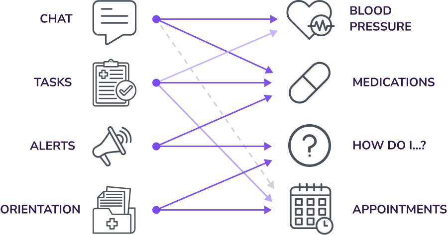
Based on each indicator’s type, relevance, and frequency, different patient contact channels were defined for each monitoring context. This ensured that health data was exchanged through the most appropriate channel, giving nurses and the system the right conditions to act on what patients reported.

Defining Channels by Indicator Context

Channels x Indicators

Each health indicator was mapped to the most appropriate contact channel based on its urgency, frequency, and content type, forming the modular foundation of the monitoring system.

Channels x Indicators

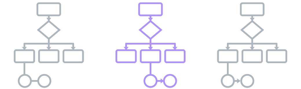
Patient Tracking - Overview

Patient monitoring was structured as a set of independent subflows, each designed around a specific indicator’s clinical urgency, measurement frequency, and the patient’s ease of interaction. Together, all subflows form the complete monitoring architecture.

Patient Tracking - Overview

A Subflow in Practice

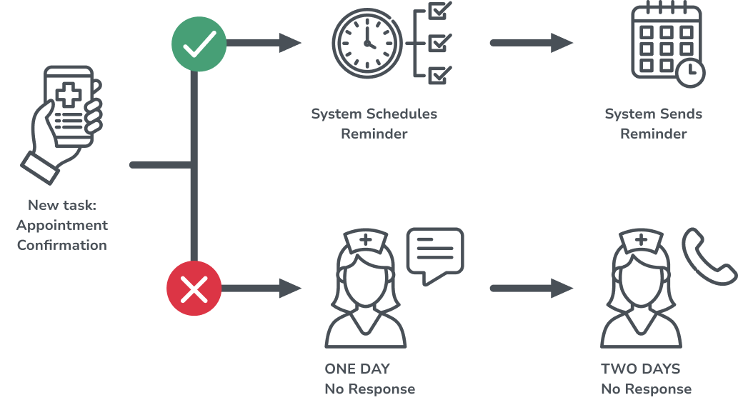
The appointment confirmation sub-flow illustrates this logic: if a patient confirms, the system schedules a reminder automatically. If there is no response, escalation triggers nurse intervention after defined time thresholds.

A Subflow in Practice

Progressive Patient Onboarding

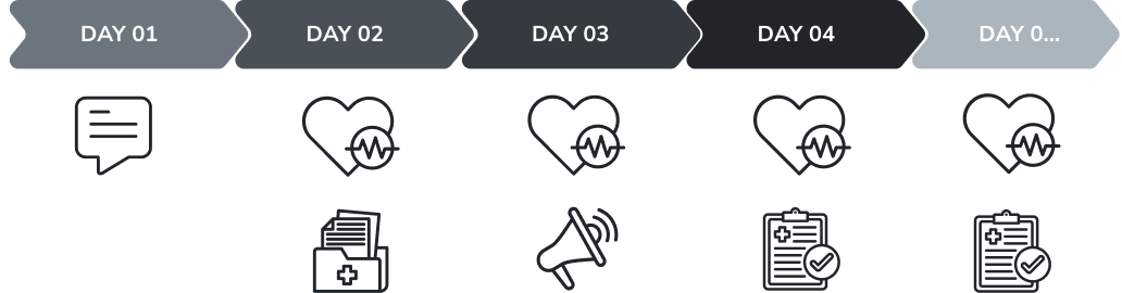
With multiple indicators and explanations to introduce, onboarding was deliberately spread across the first week of app use. Each task and orientation was delivered only when contextually relevant, reducing early friction and improving long-term adherence.

Progressive Patient Onboarding

Designing for Fast Clinical Response

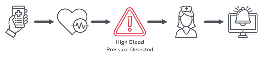
Nurses needed immediate visibility into patient-entered data and timely alerts when readings crossed clinical thresholds. I advocated for contextual triggers that gave the monitoring team a clear, objective view of each patient throughout the monitoring period, enabling faster risk recognition and appropriate response.

Designing for Fast Clinical Response

From Decisions to Deliverables

The channel logic, subflow structure, and onboarding pacing defined above shaped every screen that follows. The next sections trace how those decisions became concrete: user flows, wireframes, and the high-fidelity interfaces nurses and patients actually use.

Flows, Wireframes and Final Screens

With monitoring logic, communication channels, and nurse-patient interaction points defined, I translated these decisions into user flows, wireframes, and high-fidelity interfaces. The examples below trace that process from early structural exploration to final screens.

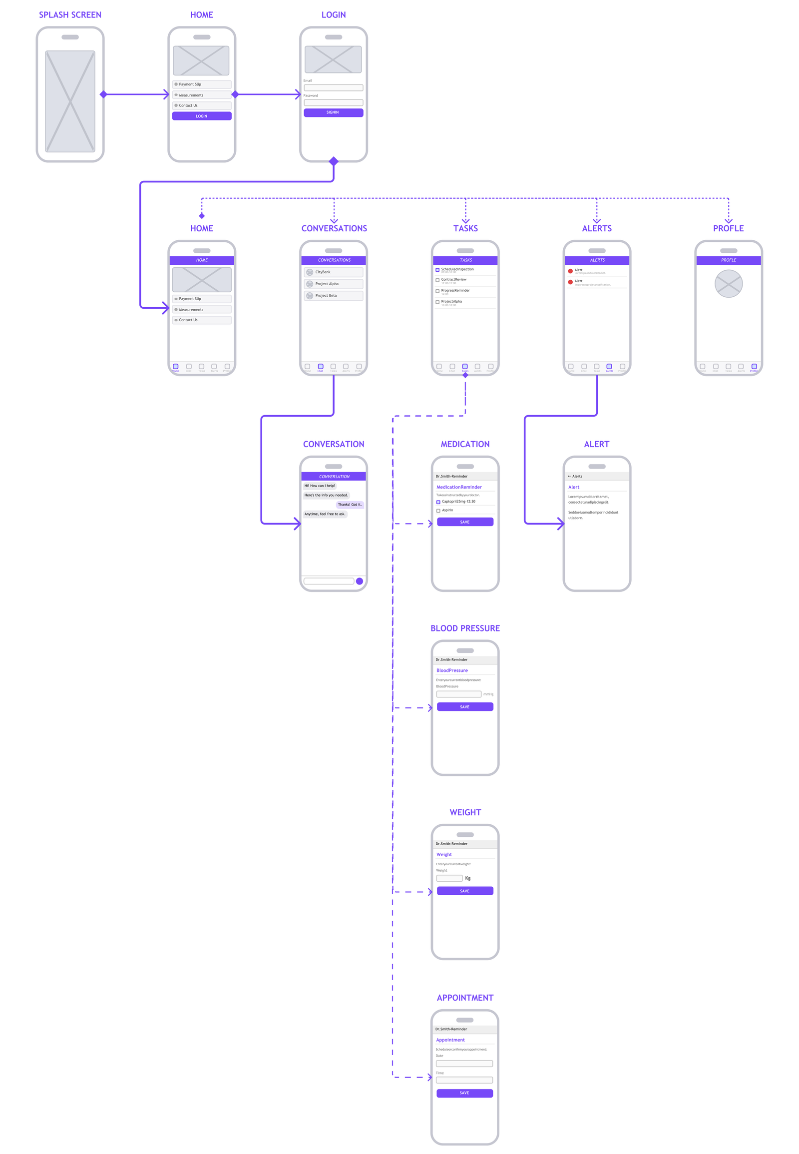
Flow Example

Patient App Navigation Flow

Before moving into interface design, all major system flows were mapped. The example below shows the patient app navigation flow, illustrating how the overall structure and indicator subflows were planned.

Patient app navigation flow wireframe diagram

Mockups & User Flow

High-Fidelity Mockups Examples

MOPE System: High-Fidelity Mockup

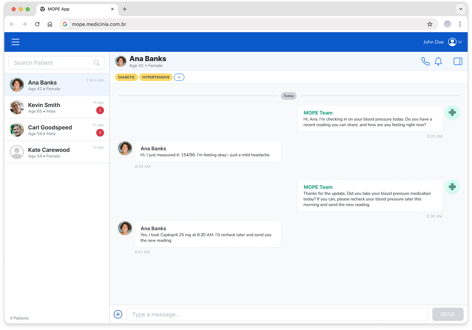
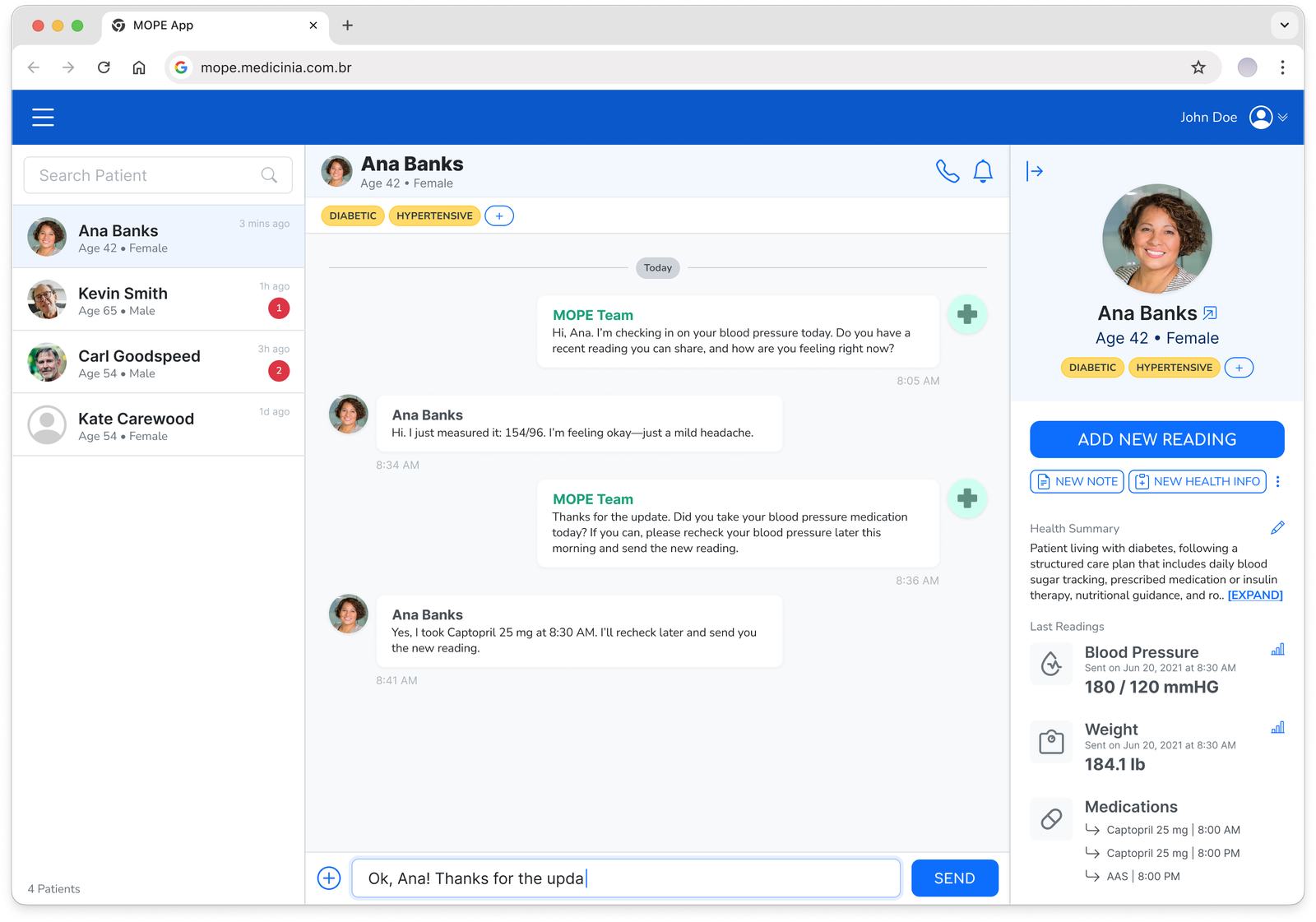
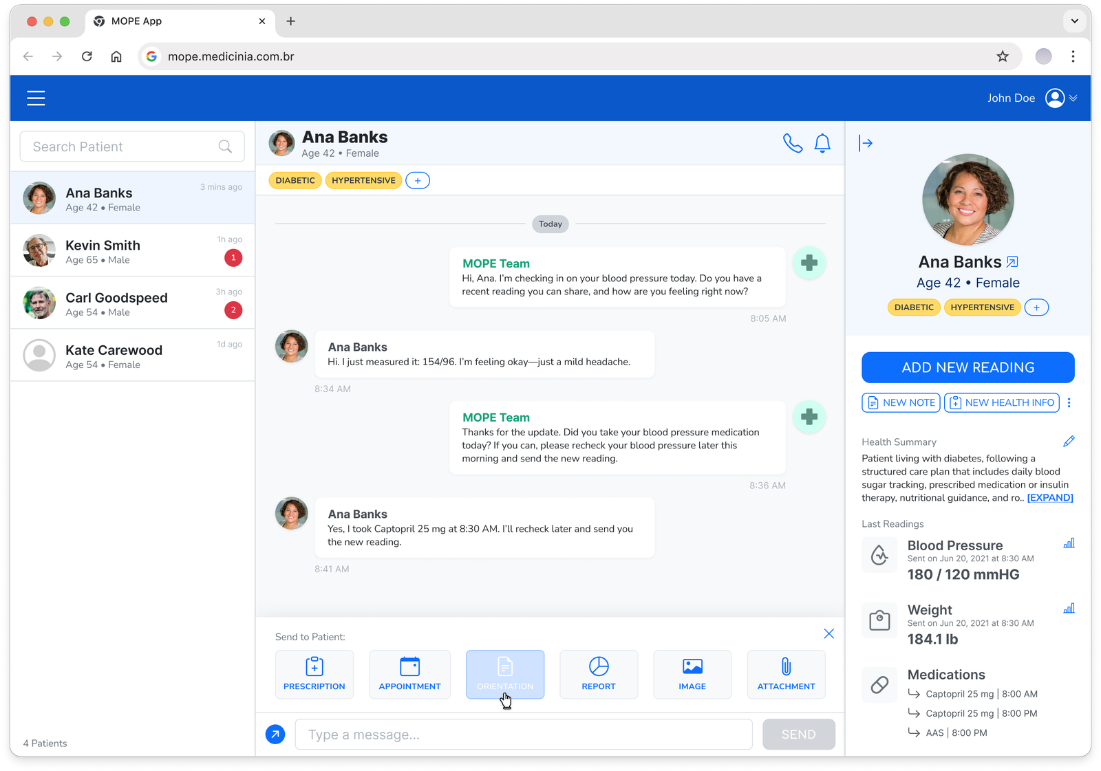
The chat screen was selected to illustrate the nurse-facing interface, as it concentrates the core monitoring interactions in a single view: patient list, conversation history, contextual messaging tools, and a real-time summary of recent readings and medications.

MOPE web app patient chat with a nurse conversation

Patient list, live conversation, and condition tags in one view.

MOPE web app patient detail panel with health summary and readings

Health summary, readings, and medications alongside the chat.

MOPE web app send-to-patient menu with prescriptions and attachments

Structured content sent directly into the conversation.

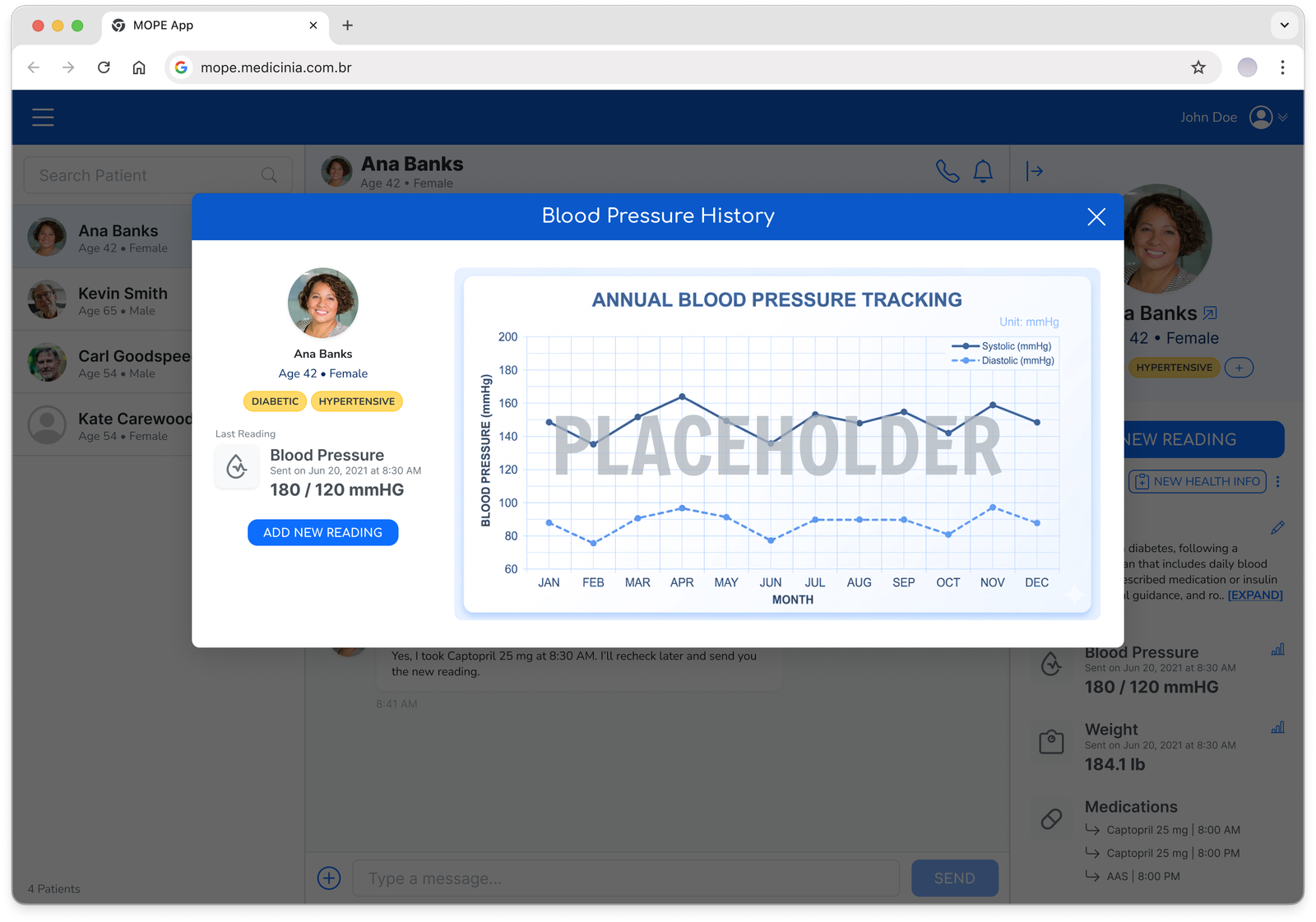
MOPE web app annual blood pressure tracking modal

Readings plotted over time to spot trends.

Patient App: High-Fidelity Mockup

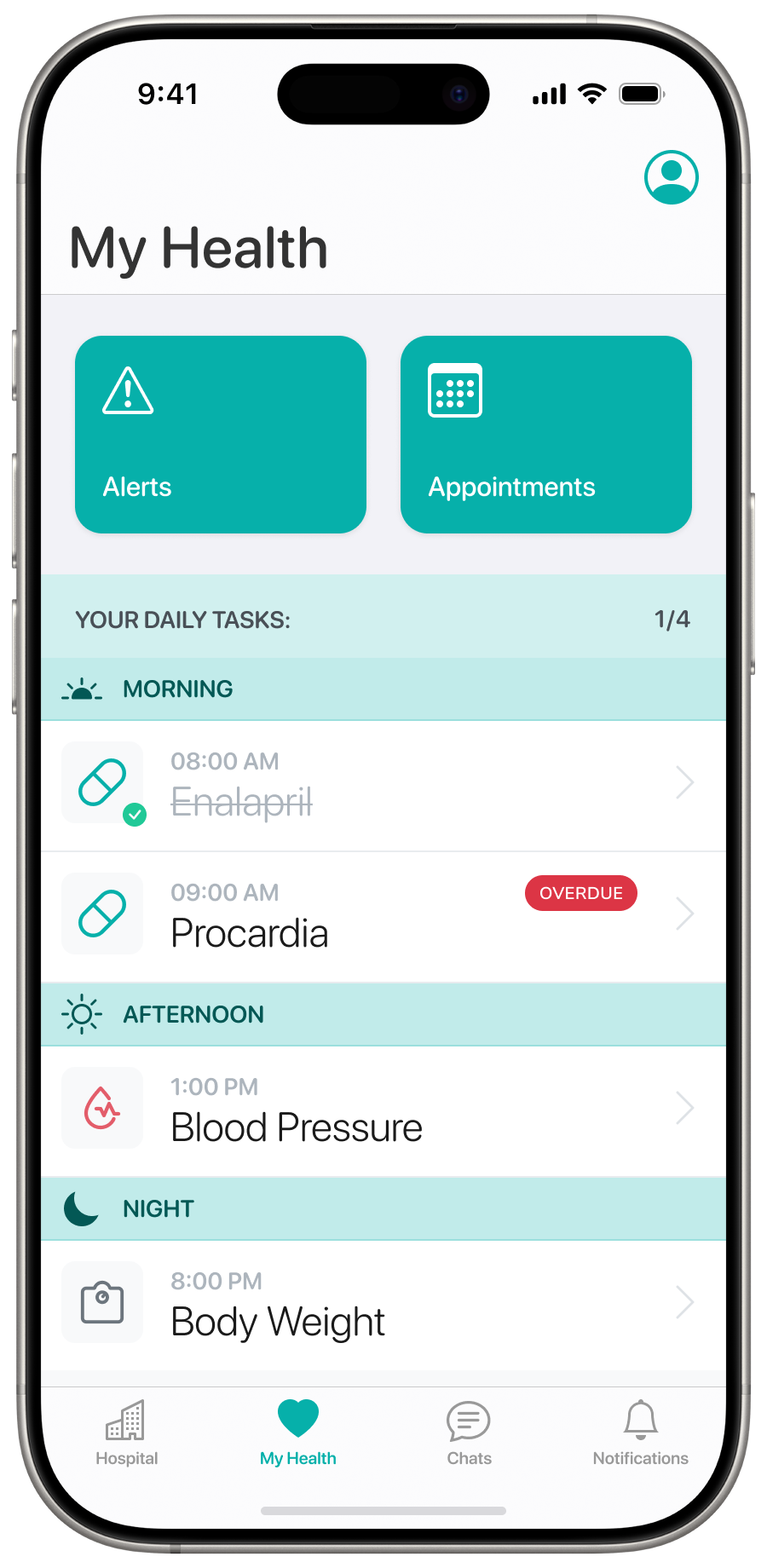
From login to daily task confirmation and chat with the nursing team, the patient app was designed to keep the monitoring routine simple, time-aware, and connected to nurse oversight at every step.

Patient app My Health home screen with daily tasks

Home screen with alerts, appointments, and daily tasks.

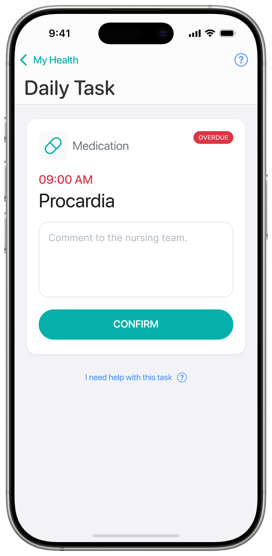
Patient app daily task screen confirming a medication

One task, expanded, with a note field for the nursing team.

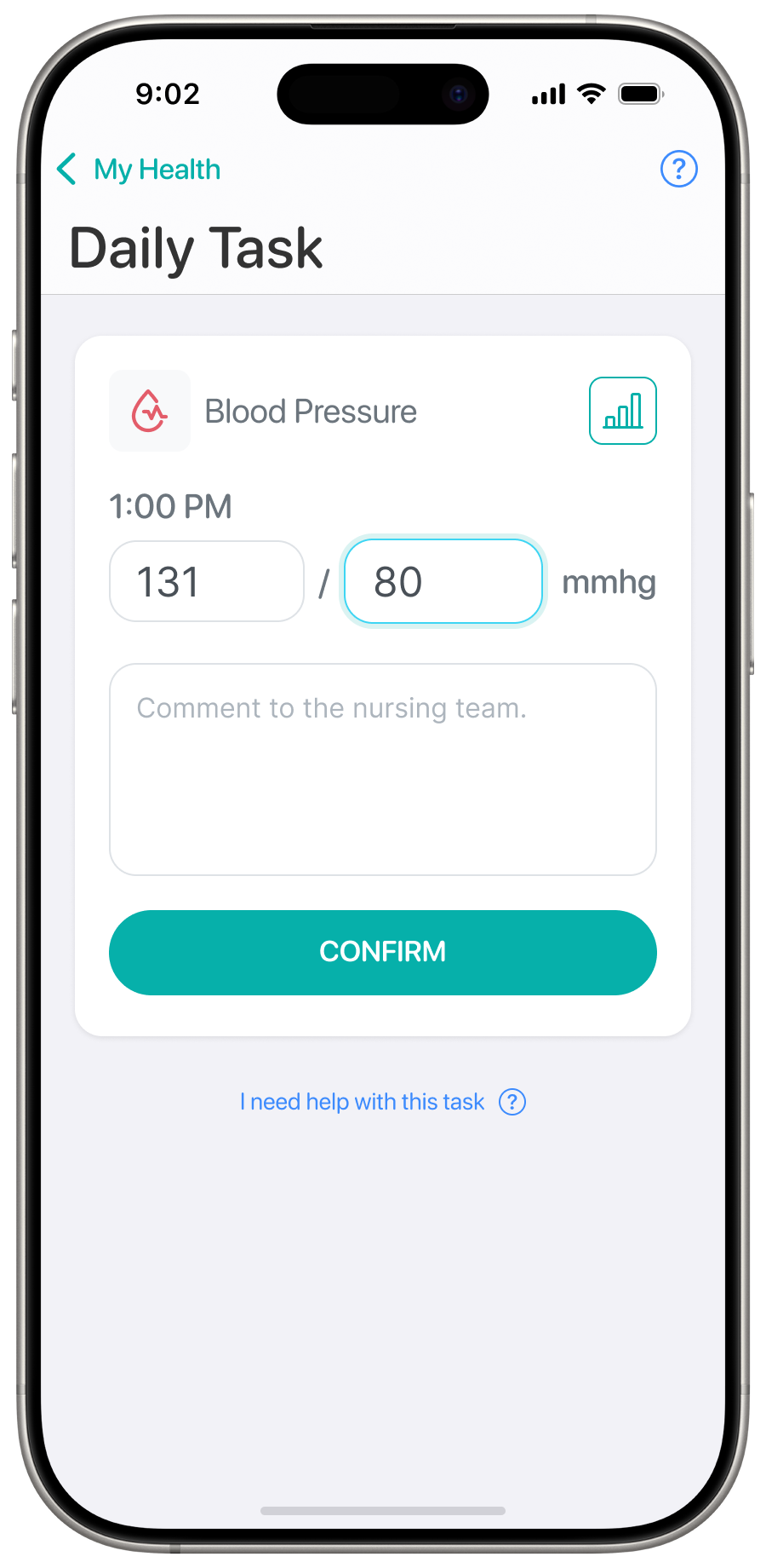
Patient app daily task screen logging a blood pressure reading

Patients enter readings directly, in place.

Patient app chat conversation with the MOPE nursing team

Direct messaging outside scheduled tasks.

Patient app login screen for São Cristóvão Saúde

Branded entry point for São Cristóvão Saúde patients.

Key Strategic Decisions

Accelerating learning through Web View

To maximize learning speed during early validation, patient-facing screens were implemented using Web Views instead of native components. This decision significantly reduced deployment friction, allowing the team to iterate on UX, content, and interaction patterns without repeated app store releases and enabling faster response to insights from testing.

Designing for change with a flexible backend

I collaborated closely on the definition of the backend data model, advocating for a generic and extensible structure. This approach allowed indicators, flows, and clinical protocols to evolve over time without major structural changes, supporting both scalability and long-term product adaptability.

Validating workflows before automation

Rather than automating processes prematurely, early testing relied on manual triggering of tasks and alerts, with the monitoring team acting as test patients. This deliberate choice prioritized understanding real workflows and refining UX and system logic before committing to automation, reducing downstream rework and risk.

Modeling for evolution

The indicator-based flow model established a reusable foundation that could support additional conditions beyond hypertension without redesigning the system.

Summary

Patient monitoring app summary

One Monitoring Flow, Two Surfaces

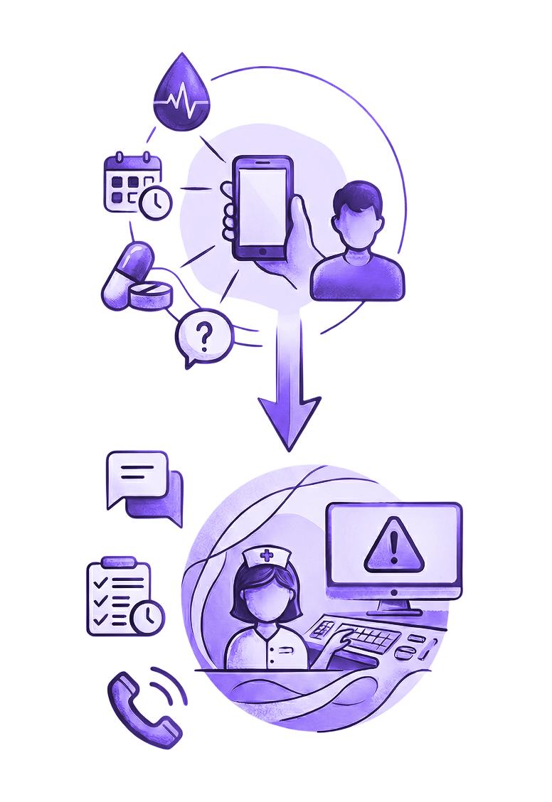
Nurses and patients interact with different surfaces, a monitoring tool and a patient app, but both run on the same indicator-based logic defined earlier. A patient's entry, a reading, a confirmed task, triggers an automated response on the nurse side, and escalates to direct intervention only when a threshold is crossed. That loop is what let MOPE scale patient coverage without scaling headcount or clinical risk.

  • Two surfaces, one logic: nurse tool and patient app both run on the same indicator-based system
  • Patient action triggers system response: readings and confirmations generate automated follow-up
  • Escalation is threshold-based, not constant: nurses step in only when a reading crosses a defined risk level
  • Result: patient coverage scales without adding headcount or clinical risk

Choosing Speed Over Polish

Building patient-facing screens as a web view instead of a full native app meant faster iteration and faster tests. Every round of user feedback could reach the product immediately, without app store review cycles slowing down what the team learned.

Outcomes & Learnings

Outcomes

  • Delivered a modular monitoring MVP aligned with clinical protocols and real nurse workflows.
  • Enabled safe scaling by combining automated alerts with nurse interpretation instead of a single linear process.
  • Improved patient comprehension and adherence through progressive onboarding and contextual communication.
  • Provided nurses with a unified view of patient communication and recent indicators, reducing cognitive load during follow-up.

Key Learnings

  • Adherence depends on timing, not volume: distributing indicators and guidance over time reduced friction and confusion.
  • Clinical monitoring requires modularity: decoupling channels and content allowed each indicator to define its own flow.
  • Automation supports (but does not replace) clinical judgment: alerts were most effective when paired with context and human analysis.
  • Healthcare UX is systems design: small interaction decisions can significantly impact safety, workload, and trust.